As the weather warms up, sweaters and khakis give way to polos and shorts. The look above brings together three of OTC’s favorite warm weather brands: Southern Tide, True Wind, and Kiel James Patrick. Each of these brands captures a particular aspect of summer – sailing across the open water, lounging with friends over a cold cocktail, or walking barefoot across a New England beach.
Together, they comfortably compliment an overall feel of relaxed ease and a weekend away from the office.
Skipjack Polo from Southern Tide. The folks at Southern Tide were kind enough to send along a couple of polos for us to test. And without question these are some of the best we have worn; and we wear a lot of different polos. Trim but not “fitted” and breathable but with some substance, this polo remains comfortable over time and handles warmer temperatures like the Southern creation it is. With a huge selection of colors from which to choose, you’ll probably find yourself ordering a few more than expected.
Southern Tide is one of the great Southern preppy brands that you always see but think, “who makes the shirts with that fish on it?” Well, now you know. Sure, inspiration for the brand struck in Italy, but it’s all about the South. MORE
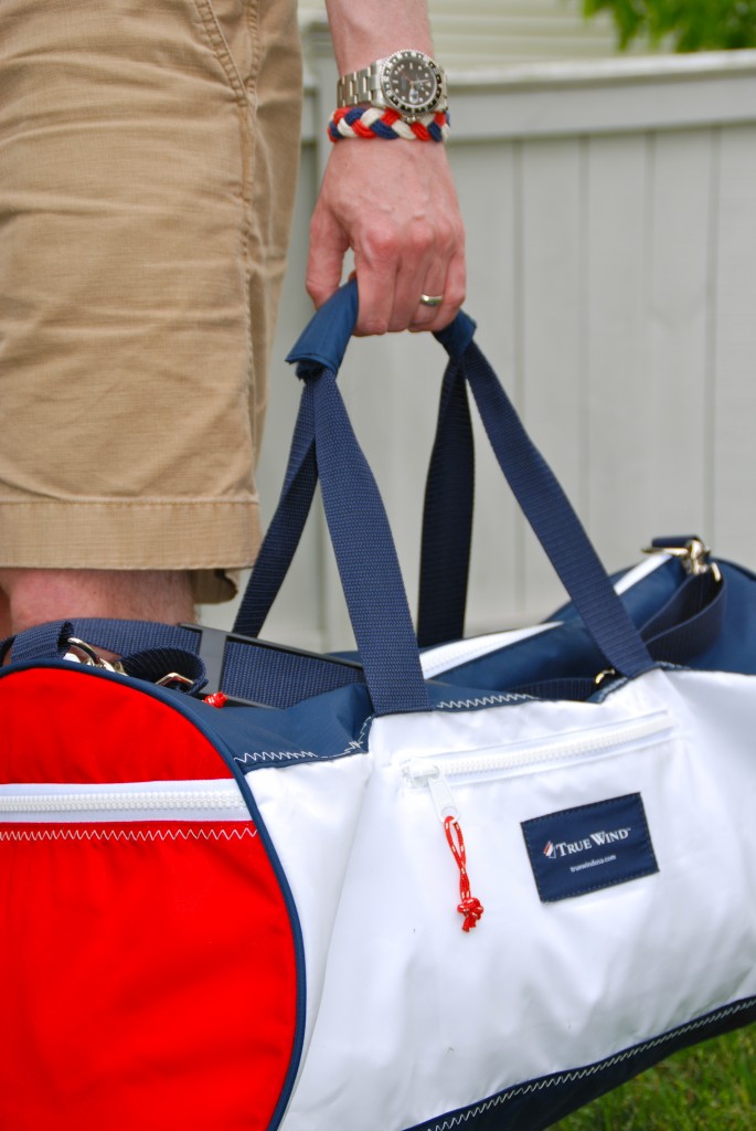
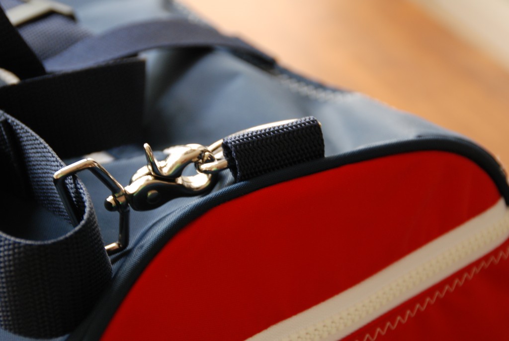
Americana Duffel from True Wind. We discovered bag maker True Wind years ago and it remains one of our favorite stories. The Dacron sailcloth for True Wind’s bags is custom woven in the U.S.A, and the bag’s nickel-plated hardware is solid brass, from the same company that makes Coach’s hardware.
The Americana Duffel shown here is an outstanding and durable bag perfect for the beach or cross country flight. It’s distinctively nautical styling belies a totally functional bag meant to take serious abuse and lots of salt water. And, it’s preppy, seaside purpose-built looks makes this a bag that you will put to use for decades to come. Don’t keep it too clean. MORE
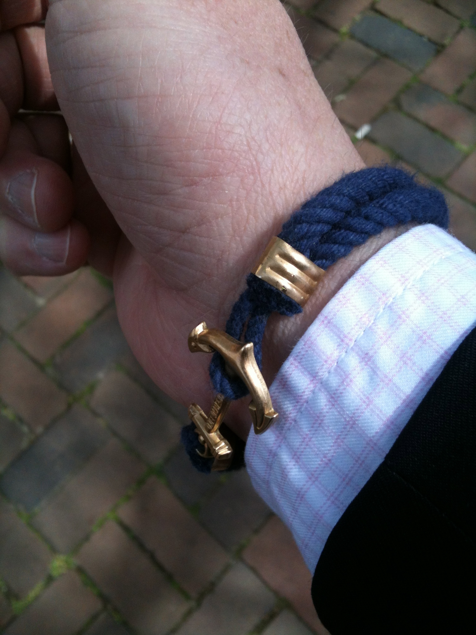
JFK Bracelet from Kiel James Patrick. As if you didn’t know. This particular Turk’s Head Knot bracelet references the classic woven sailor’s bracelet of yore, but in a patriotic red, white, and blue. And, the cast anchor closure is actually a copy of the icon featured on Rhode Island’s license plate. KJP is a brand built on the windswept good looks and charming gaze-to-the-distance stares of Kiel (like Kyle) James Patrick. And while his omnipresent social media visage may lead you to believe he and his crew mostly wander on the beach, hang out around bonfires, lounge on perfectly aged leather sofas, and spontaneously strike nonchalant poses for the camera at seaside estates, remember one thing.
Kiel and his small team hand make every one of those bracelets and belts. He has painstakingly built up a network of local craftsman who leverage their particular expertise to the larger goal of making sure that every Kiel James Patrick product is not only American Made, but Rhode Island Made. And Kiel isn’t just the chief model and brand ambassador. He continues to build his company the old fashioned way; manning the sewing machine, hitting the design board and, staying up all night dying yarn by hand to meet orders. Oh, and in his spare time he took on Sears-owned Lands’ End for blatantly copying his signature Croffix Sailing Belt and won. MORE


Every one should see this post.Because of,Most of the persons doesn’t know “which kinds of casual should wear on summer?”
Cool post and style choices! We agree with the Skipjack Polo and how breathable and comfortable it is! In addition, we love to carry Kiel James Patrick and tell our customers at Coastal Urge about the handmade Rhode Island brand.
If your work depends on it, learn to check just three times.
The ship owner could see that the captain had paid the on
going rate and the merchants were all given the same
opportunities to offer their services. With
the new Jelly Bean, you will be able to expand notifications and get a preview on
the recent e-mail message.
I was curious if you ever thought of changing the layout
of your site? Its very well written; I love what youve got to say.
But maybe you could a little more in the way
of content so people could connect with it better. Youve got an awful lot of text for only having 1 or 2 pictures.
Maybe you could space it out better?